


hanna werning
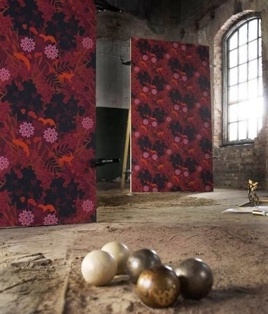
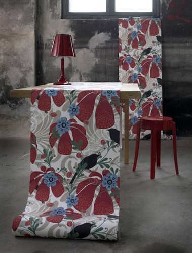
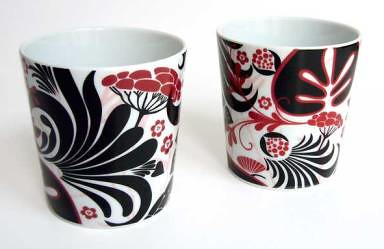
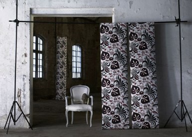
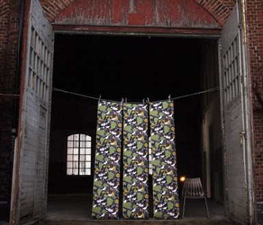
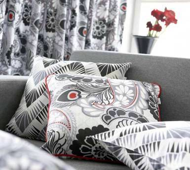
i was chatting with frida (of the late husmusen) about hanna werning yesterday and she mentioned some of these designs that i hadn't seen much about yet. everyone went nutty over the colorful werning posters but i'm loving the darker, richer side of werning's work. full of bold pattern and luxe accents, her latest collections of wallpaper (not posters but the real thing) and textiles go perfectly with the changing fall colors and switch from hot summer days to cool fall afternoons. the burgundy, black and red patterns would look beautiful with gold accents or some baroque detailing (if you haven't already had enough of baroque yet). or if you want to play down the richness pair them with a nice clean mid-century piece for something more minimal and scaninavian. you can click here (under news) to see more of hanna's latest work. thanks so much to frida for the tip! also, frida passed along this site that tracks scandinavian design- great find. [we're off for the last summer beach weekend- see you monday!]
Labels: windows and walls
posted by design*sponge @ 25.8.06
![]()


3 Comments:
the split-leaf philadendrons (spelling?) look gorgeous
how do you do it? i love this site. it's always so fresh with beautiful ideas. it's inspiring.
Thanks for the link to husmusen. What a treat.
Post a Comment
<< Home