|
 |
 |
 |
| |

COME PLAY WITH THE HIPSTERS [firstop design weekend*williamsburg brooklyn]
firstop, a williamsburg brooklyn based non-profit promoting local artists and designers is having a design weekend october 2-3. from 12-8 pm, you can come check out new, experimental, and professional design. there will be a network of open studios, stores, workshops, and exhibitions all over the neighborhood. so get on the L and come see how they do it on the other side of the bridge. not to be missed- the future perfect, anything by lorena barrezueta and one sixty glass. see you there! Labels: design shows
 I WON'T BITE [drop me a line*pleeease] i never hear from anyone, so drop a line or add a comment, won't you? i'd love to hear from you guys...
apparently everyone hates the design museum
 sir terence conran was the nail in the london design museum's coffin this week. following the vacuum legend himself, james dyson, who recently bemoaned the design museum's "empty styling" and left his position as chairman of the museum, sir conran (the namesake behind the utopia that is the conran shop) followed up just two days later and threatened to leave the museum as it had "betrayed it's founders' ideals". claiming the museum is now full of "tinsel exhibitions", conran, one of the founders of the museum itself, threatened to leave if the situation continued. i say conran and dyson should team up and make their own museum-they seem more in touch with real design than the museum that is currently housing an exhibition on the typography of harper's bazaar. really. i'm not kidding. way to be design museum- you've managed to piss off two of the most important brits in the design world AND put on another fluff exhibition. keep up the good work. Labels: miscellaneous
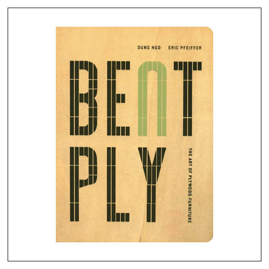
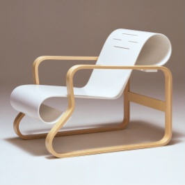
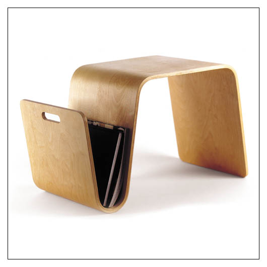
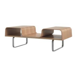
R.I.P. bent plywood
 blame it on aalto, or even charles and ray, but bent plywood is everywhere and it has to be stopped. admittedly, i'm the world's biggest hypocrite because, for the last year and a half, i've been walking around drooling over the same stuff i'm about to demand be banned from the marketplace but i promise this is all for your own good and it won't hurt a bit. everyone from offi to ikea has picked up on the trend that designers like the eameses started long ago and because of it we're now awash in a sea of bent plywood. the appeal was (and still is) rather obvious: clean lines, organic curves, minimal joinery and above all- minimal cost. the beauty of the movement was the way that a simple, commonplace material like plywood could be turned into spectacular furniture for a relatively inexpensive price. when aalto, the eameses and thonet first set out to explore this medium, i doubt they could have imagined the way it would eventually dominate and control the mass market like it does now. bent plywood seems to have become the default material and style that any designer can use to appeal to the current market (both high and low end). the origins of the bent plywood movement belie what it has become- an aesthetic juggernaut that allows bent plywood sculptures from the eameses studio to sell for $130,000 at auctions. so, all good things must come to an end so, bent plywood, despite your pleasing minimalist curves and sturdy, simplistic construction, i must say goodbye to you and make way for new trends, new ideas and new creativity. it's hard to say where exactly this new inspiration will come from or in what direction it will move, but you can always be sure the end of one movement sparks the beginning of another- so this time, i'm hedging my bets on felt. i know, sounds crazy (and so do these people), but the emergence of heavy-duty, high quality felt in the design world makes me smile, for it too is based on the same values the disciples of bent plywood held so dear- inexpensive, familiar materials used in uncomlicated ways to create beautiful designs. 
IN THE BEGINNING [no. 41 chair*aalto] along with the eames, aalto flipped the switch... and there was bent plywood.
BENT SWEDES [lagfors*ikea] i'm sure it means something in swedish, but really, could they try a little bit harder to pick names that rolled off the tongue more easily?

THE EX [mag table*offi design] i used to want one of these for every corner of my house. sadly, i've given up the dream in hopes that a new design trend will occupy my obsessive mind
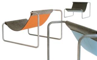
THE FUTURE OF FELT [the felt up chair*blu dot] it may not be comfortable looking, or comfortable at all, but neither was bent plywood. besides, felt is just so cool. but don't get me started on the orange and grey thing....eesh
Labels: furniture
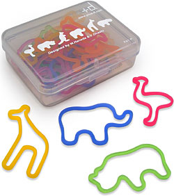
you win some you lose some
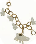
  so maybe i'm the last one on the boat, but i've fallen madly in love with these rubber bands from innermost. there's something really sweet about brightly colored animals that makes an ordinary office object come to life. i've always been a fan of things designed with children in mind, especially when it takes something that would ordinarily be boring to a child (ugly tan colored rubber bands) and makes it a tool for creativity and imagination. so, even if i'm late to the rubber band party, i'm glad i made it.
and one more thing, even though i was the last to discover these cute animal supplies, i managed to beat new york magazine to punch with it's story on metallics. ha! Labels: accessories
the greatest apartment....in all of new york city
eternally exaggerating and perpetually entertaining, the donald simply can't be ignored. prone to, ahem, slight exaggeration, the master of hyperbole (trump, to those of you wondering) accepts nothing but the best and for once, i'm here to agree with the man- at least on the issue of interior design. but before i begin, let me clarify that i'm talking about the apartment on the apprentice- not trump's apartment. he claims to have "the greatest apartment in all of new york city" but for my money, if it were to win any awards it would be for the amount of tacky crap fit into one apartment. the man really has NO taste whatsoever. thank god the people he hires do.
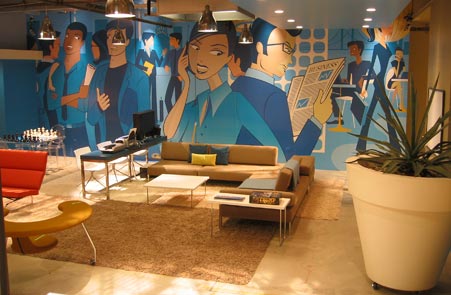
last season's apprentice apartment was marked by mid-century icons (the best mid-century icons in all of new york city...)- everything from vitra's eye clock to harry bertoia's wire chairs graced the apartment- not a bad deal for people who are working for quite possibly the tackiest man... in all of new york city. this season was no exception as we tuned in and found season two's apartment full of thomas paul and angela adams designs. not to mention the greatest living room, bathroom, bedroom and kitchen...in all of new york city. west elm is a prominent player in season two's apartment- most things in the bedrooms came from the chic dumbo retailer and give the apprentices' bedrooms an air of clean, crisp simplicity. now, admittedly i'm a sucker for cute, graphic patterns on anything, but the dwell sheets they used this year are really spectacular. the designers' ability to take small spaces and fill them with color, pattern and class, all the while meeting the demands of television lighting and filming, is proof positive that trump really does get the best when he wants it. where the whole thing shows signs of falling apart is the designers' attempts to fill large, camera-friendly spaces with wall murals (eeeecch!) that depict avid young business people on cell phones and in the middle of important transactions. i guess i should be glad trump didn't commission a 10 foot tall painting of himself, but WHY did they have to go and ruin the charm of the apartment with those hideous murals? here- go look again. it's hideous. and what exactly is that gigantic planter all about? really. it is the ugliest planter...in all of new york city.
all in all the apartment is saved by the designers' ability to insert fantastic pieces like allan switzer's artwork and jonathan adler's french regency-style furniture into the mix. these touches show a keen eye for design and a level of taste at least a few notches above their boss'- which is a very good thing. after all, the donald would never settle for any less than the best interior designers in....well, you know the rest. 
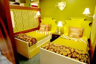
THE GREATEST BEDROOM IN ALL OF NYC [girls' bedroom*the apprentice season two] sheets and comforters by dwell, pillows by thomas paul and shelving from west elm

WHAT WERE THEY THINKING [wall mural in suite's rec room*apprentice season two] what is that planter about?? it's gigantic! and i feel like that mural is an ad from that lavalife dating service you see on the subway. too much. no murals of business people in homes- it's too much.

TRUMP GOES VICTORIAN [second girls' room*apprentice season two] more dwell bedding, thomas paul and victorian wall accessories.so much classier than trump's pad

ADLER KNOWS BEST [jonathan adler furniture*apprentice season two] adler does his thing in the apprentice sitting room

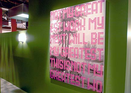
ART SCHMART [this is not my greatest work no. 2*allan switzer] switzer's work is fantastic. i'm surprised trump approved it despite the fact that it is neither composed of nor dipped in 24 carat gold.
Labels: interior design
graphic gods

i am a 2x4 junky.
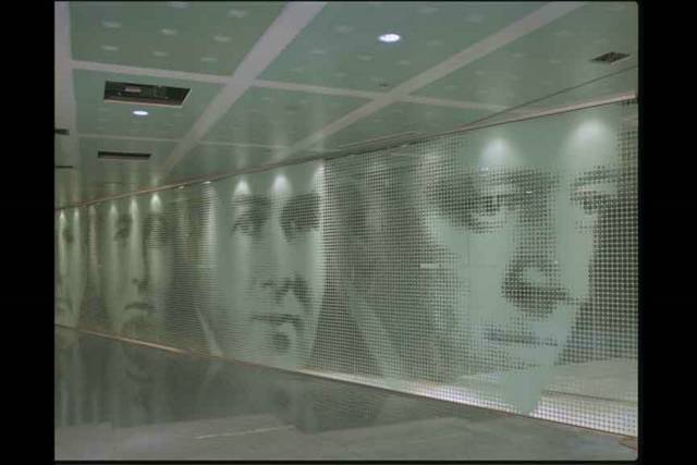
a fan of their work since day one, i’ve yet to be disappointed by a single project of theirs. in a time when hip graphic design firms are permeating the design industry as quickly and extensively as reality shows are infiltrating television, it can be hard to spot the real thing. but trust me when i say 2x4 is the real deal. founded by michael rock, susan sellers and georgianna stout in 1994, 2x4 focuses primarily on communications for art, architecture and culture-related projects. they’ve worked with clients as diverse as the new york times magazine, knoll, moma, the guggenheim museum, vitra, prada, the p.s.1 center for contemporary art, the nasher sculpture center, diller + scofidio architects and of course, rem koolhaas. comprised of writers, artists, digital filmmakers and designers, 2x4 houses some of the most talented people in the industry in one modest office on varick street in new york. i could gush on and on about how cool i think they are (and believe me, they are) but i find their work speaks for itself. some of their most celebrated work to date revolves around two very famous names: muccia prada and rem koolhaas. koolhaas enlisted 2x4 to design the interior and façade of the illinois institute of technology campus and ended up with some of the most interesting interiors and exteriors i’ve ever seen. 2x4 combined graphics, textures and images to create a feeling of modernity within a building designed to honor architecture’s past (not to be missed: the building’s founders wall comprised of portraits made of tiny circular symbols). for prada, 2x4 designed (and continues to design) some of the most spectacular wall murals for the designer’s soho store. their first, and my favorite, solution to this problem was a pattern called “china” made from one large, repeating image of a chinese woman with her arms raised. what makes the image interesting is that it is comprised of individuals in a stadium holding up placards with a single color or pattern on it that, when combined, formed the image of the one woman with her arms raised. the effect is nothing short of astonishing and makes clear the reasons for 2x4 success. from wall patterns, 2x4 moved on to patterned wall coverings- in the form of two textile collections designed for knolltextiles. dubbed field theory and chatter, the collections were based on space. michael rock described the design process for the knolltextiles collection as, “ a creative phase that yielded hundreds of rough designs from which these two collections were derived; one that references urban space and one that refers to virtual space.”
famous for their branding and identity work as well, 2x4 has created amazing campaigns for vitra, knoll and the nasher sculpture center (their work for vitra was the most impressive and for me). these guys continue to plug on, working with some of the most impressive names in the business while, at the same time, cementing their place in the design world.

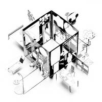
MIES PLEASE [founders wall inside iit*2x4 with rem koolhaas] some of their best work to date- the facade and interior design of the iit, an ode to mies van der rohe from the gang at 2x4. (faces are made of tiny figural symbols)

MUCCIA'S DARLINGS [mural for prada soho*2x4] 2x4 has become prada's unofficial design team, coming up with some of the most fantastic wall murals anywhere. (see above text for more details on this particular pattern)

WAIT A MINUTE [pause*2x4 for knolltextiles] super-scale graphic wallcovering based on type

BIRD'S EYE VIEW [exurban fabric from knolltextiles*2x4] inspired by the aerial view of urban and suburban landscapes, exurban is a vinyl wall covering from knolltextiles' newest collection by 2x4

2x4 WASHES UP [malin+goetz logo and branding*2x4] vitra alumn andrew goetz hired 2x4 to direct the imaging of their new skincare line based in the meatpacking district. hip and minimalist, it's classic 2x4 aesthetic.

NEW TWIST [chair wall at vitra's la showroom*2x4] in one of the most amazing ad campaigns i've ever seen, 2x4 managed to rethink vitra's classic designs and create fabulous wall-murals comprised of rotated chairs.
Labels: graphic design
 CAN'T WAIT [i heart huckabees*movie out soon] great cast, great design, what more do you want? the entire ad campaign is gorgeous, so i hope the movie turns out just as well. watch the big trailer and listen to the noise it makes when the names come and go. it sounds like tiny plastic chips falling off a ledge. so sweet. Labels: miscellaneous
the real burning man (without all that hippy crap)
scott beckerman has work on display at troy. go see it. it's cool. or go see scott here. he's cool, too. 
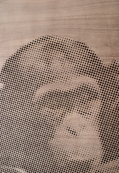
BURNING MAN [ben*scott beckerman] beckerman's pieces at troy in soho are amazing. he laser cuts wood with this heat torch-thing (yeah, i know, real technical huh?) and designs images onto various wood "canvasses". beckerman hasn't replied to my email yet but when he does i'll let you know how he does it.
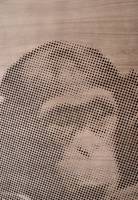
MORE BECKERMAN [chimp*scott beckerman] close up of laser effect
Labels: artwork
shiny things rule
gold and silver seem to be the rage in fashion so of course, design is jumping on the band wagon. i'll have to say though- i'm all about this trend. metallics are always hip and if i can have a gold orange juicer than by god, i'll take one! the bling bling medallion is kinda preachy for my taste, but i threw it in for good measure, because i can. 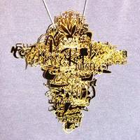
HOLLA HOLLA [bling bling medallion*frank tjepkema] i can't pronounce his last name to save my life and yeah, it's kinda preachy with all those logos, but it's funny and shiny. win win. (fyi...it's a bunch of corporate logos if you can't tell...)
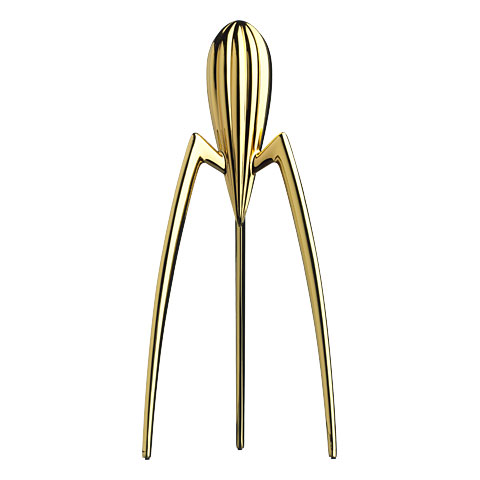
 TEENY TINY TOYS [mikro house*sam buxton] found this at moss. it's like a tiny house set for grown ups. you can't really do anything with it, but who cares? bet it'd look cool on a shelf or a desk. comes in silver and gold and is tragically cute.  GOLDEN BOY [juicy salif*starck for alessi] anything starck touches turns to gold, so why not a juicer? available at moss, it's worth its weight in well, gold.  BOUNTIFUL BOONTJE [garland (in silver)*tord boontje] tord boontje can do no wrong. well, except for making a cheap plastic version of his GORGEOUS garland. available in copper and silver, it's a must if you've got bare bulbs. i mean come on, who lives with bare bulbs? what's wrong with you?  JERKS [gold ipod mini*apple] this company consistently screws me over, but i love the gold and silver ipods. i'm a sucker for metalllics... 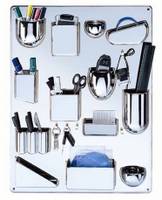
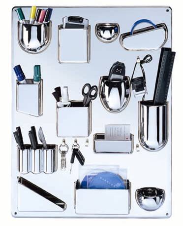
SHAMELESS SELF PROMO [utensilo*vitra] yeah i work for them, so what? you wanna start somethin? dorthea becker's chrome organizer is perfect. i don't care if it's cheating, i'm promoting it anyway. ha.
Labels: accessories, artwork
|
|
 |
|
 |
|
|